Unless you're reading this as an RSS feed or email, you've probably already noticed that Grey Ops has undergone a facelift of sorts. It was a struggle, but I think I managed to maintain the previous aesthetic feel of Grey Ops, while making it a bit more streamlined and in some ways more spartan.
All the content previously on Grey Ops has been transferred over (with some of the videos not filling the entire post section, but that doesn't really affect anything), including the 3000ish Disqus comments. While it would appear that the column containing the post content has shrunk, it hasn't. It actually increased in size, but the sidebar increased considerably more in size so I can take advantage of some new content. In particular, I migrated a mirror of the chat gadget into the sidebar (with sound automatically off so nobody gets annoyed), so people can leave shoutouts or chat it up on the main page after having read an article.
Also, sharing and "liking" whatever post/page you're on has gotten a lot easier with the integration of a floating sharing object to the left of the blog. It took about an hour of fiddling with positioning to get it working well for every platform I had access to, but if it looks like junk on your end (ie overlapping into the middle, which it never should) please let me know!
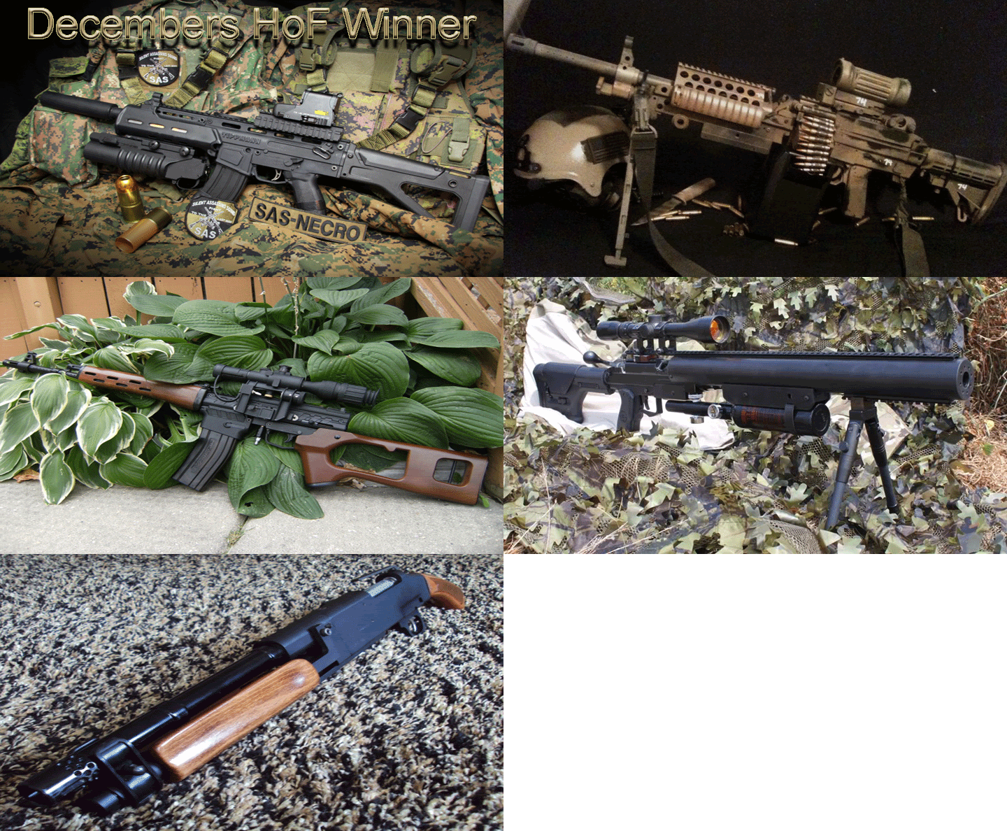
Another cool feature that is now possible is that I can now set up image backgrounds on the blog very easily (static ones). So what I may do in the near future is have a Grey Ops photo contest, with the winner having their photo act as the background for a period of a month or something.
If there is a feature people would like to see added, now's the time! I'm still in blog makeover mode so it would be very easy to integrate something new. And please, let me know what you think in general!


